STT Leap Office
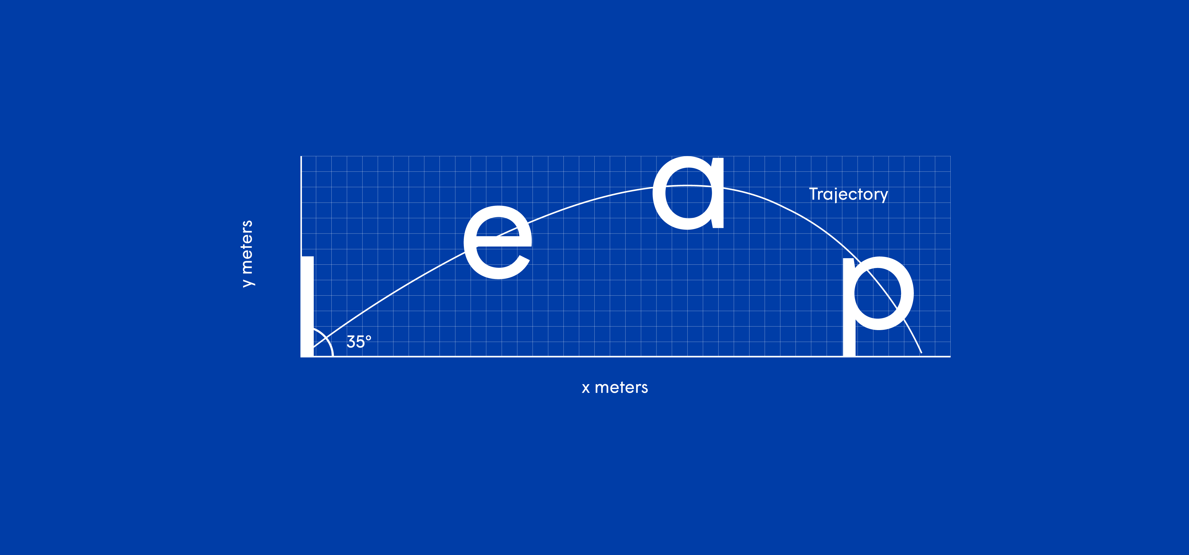
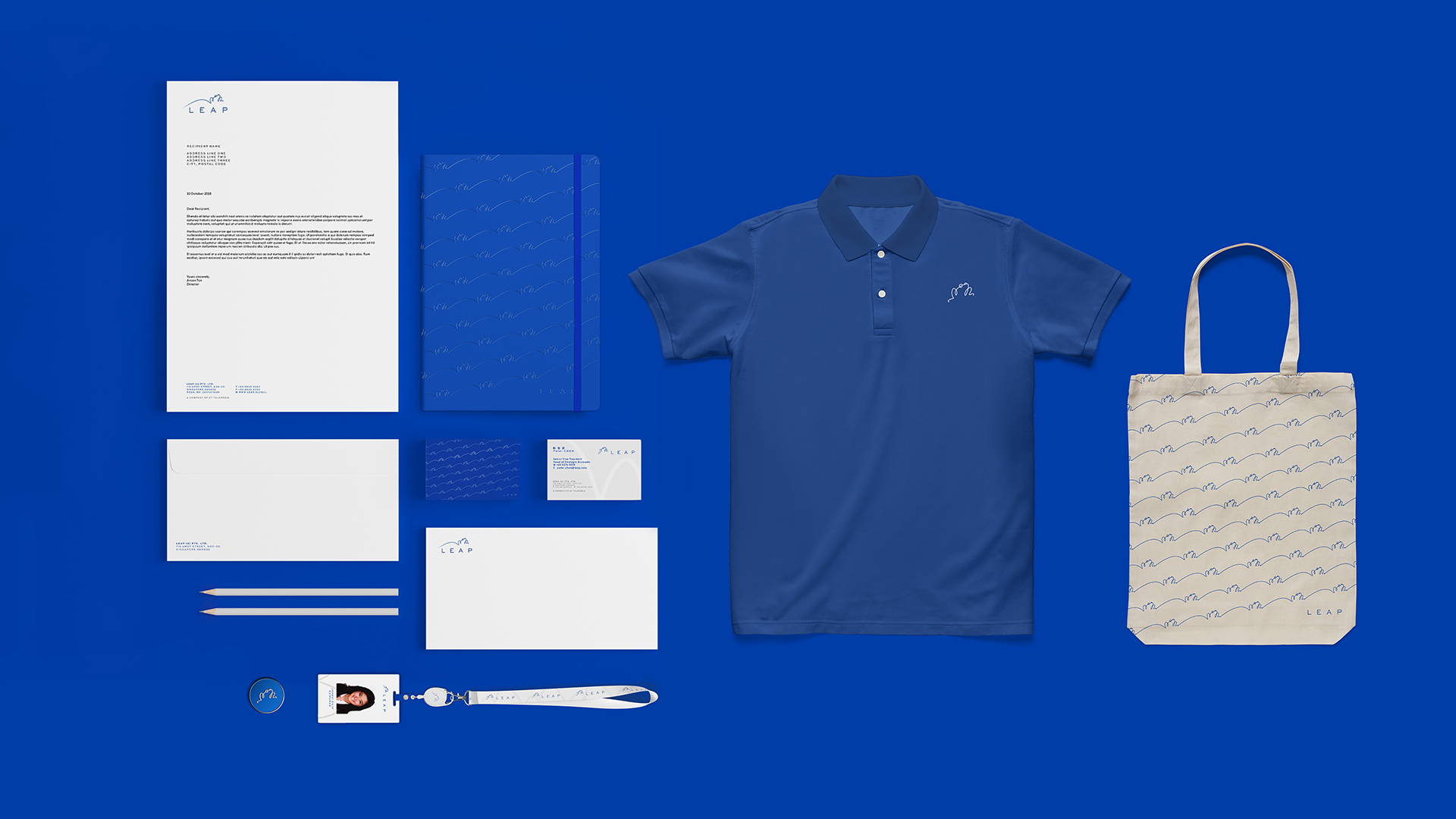
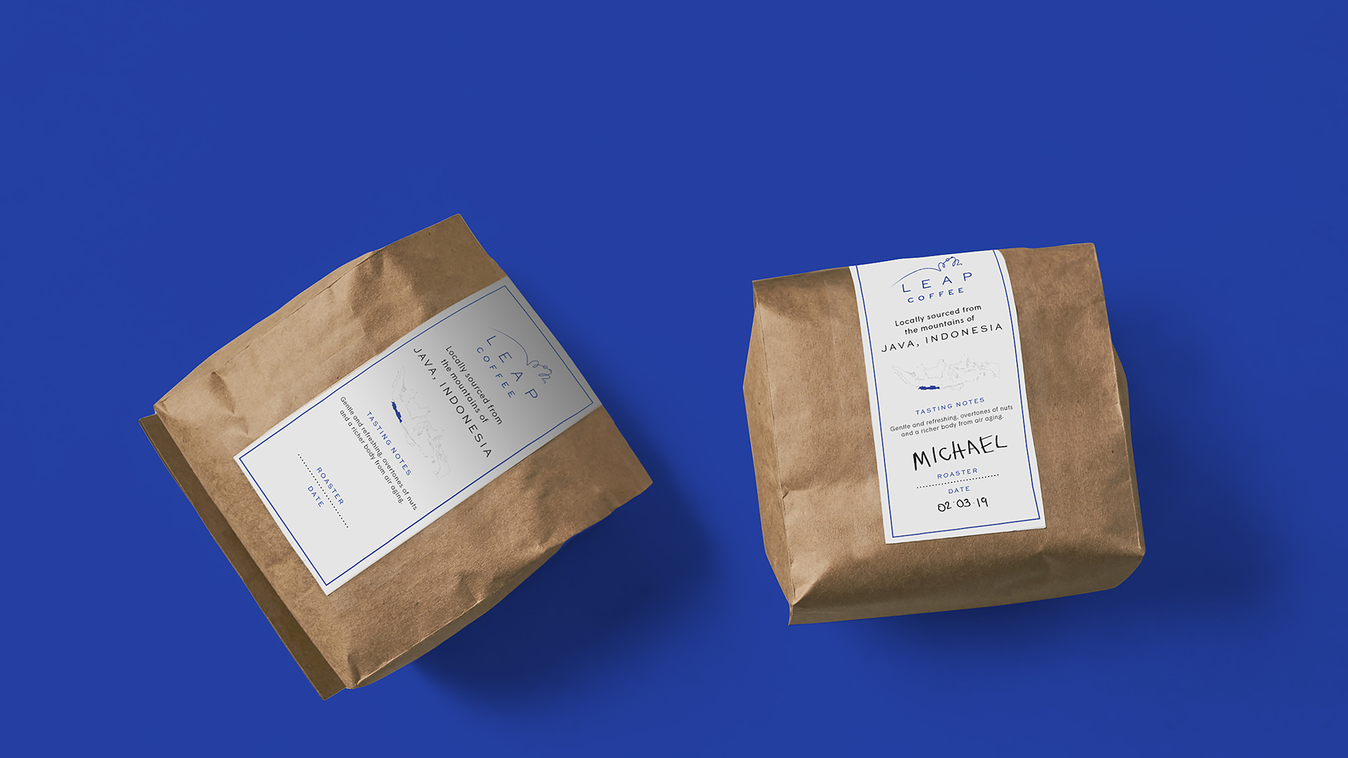
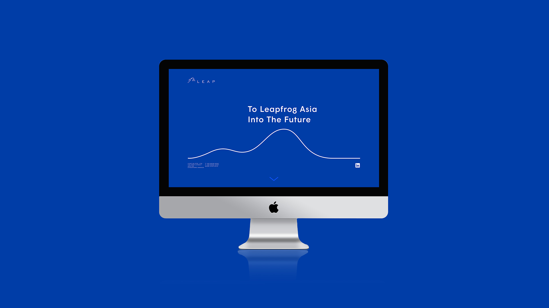
Leap is in the business of transformation. The logo shows a singular continuous line of a frog in projectile motion, over a clearly defined and confident brand name. Spatially, Leap’s office is a bold and characterful re-interpretation of the traditional shophouse archetype.
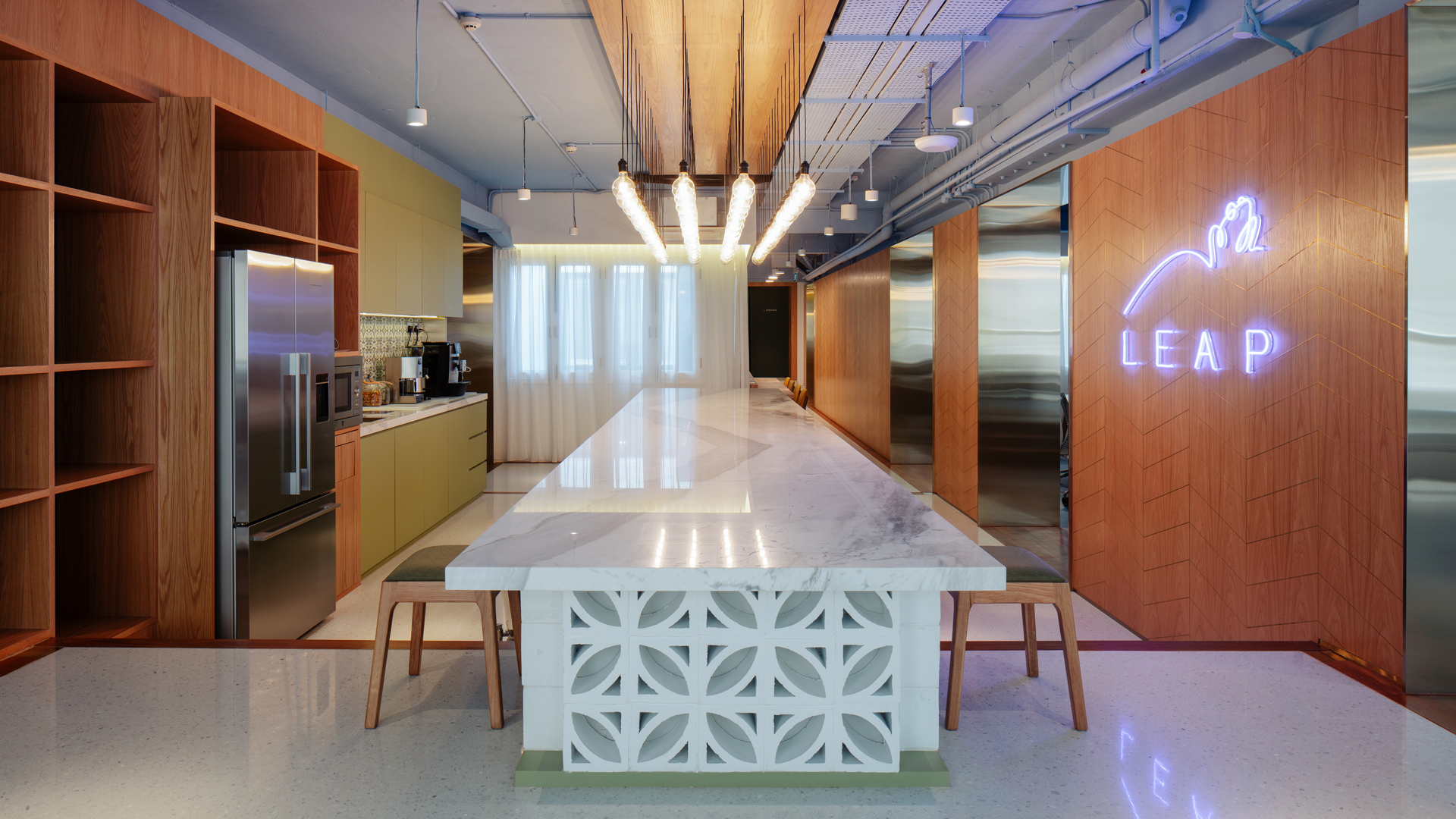
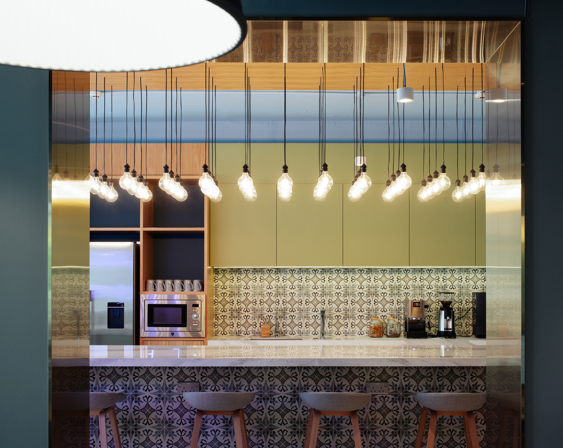
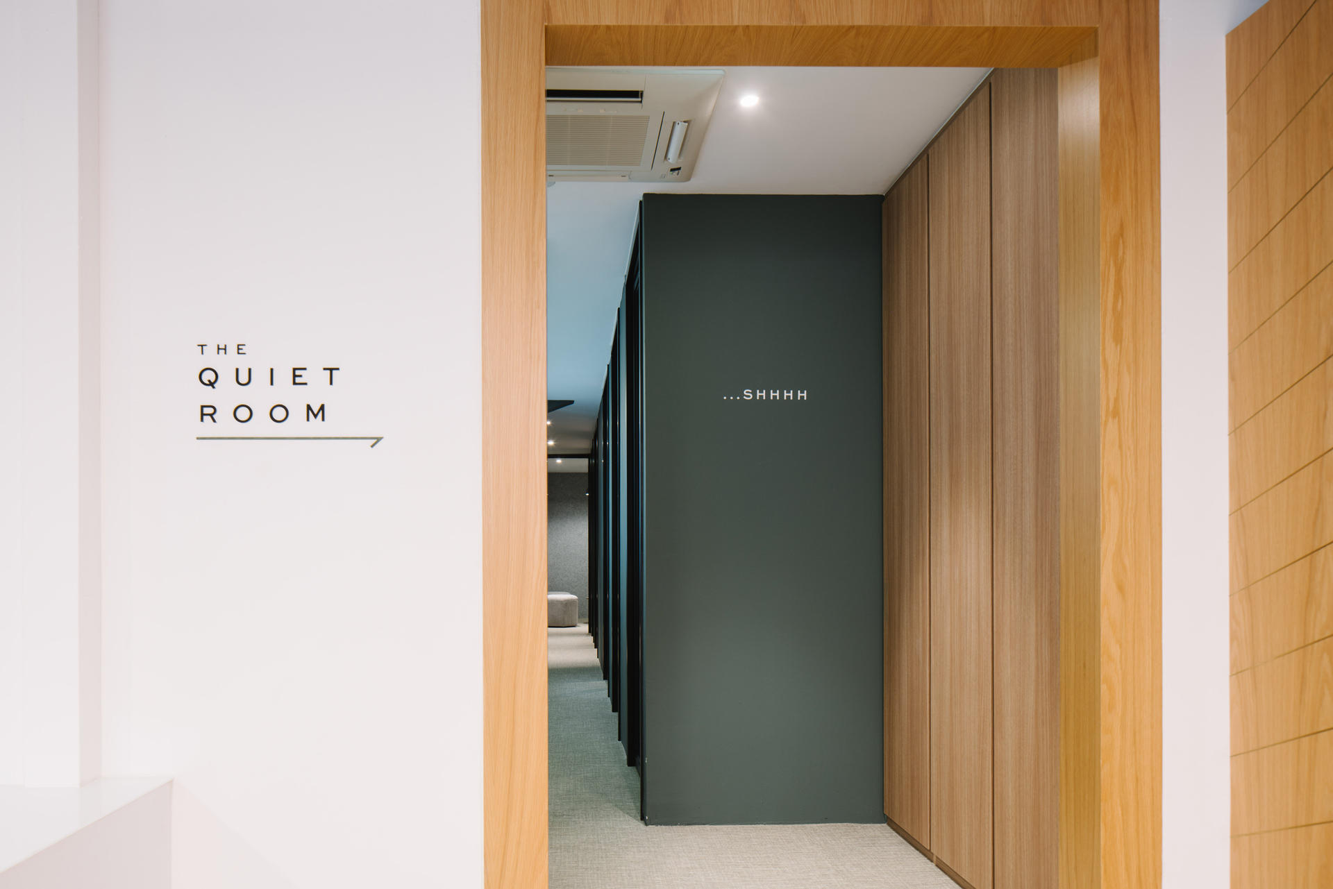
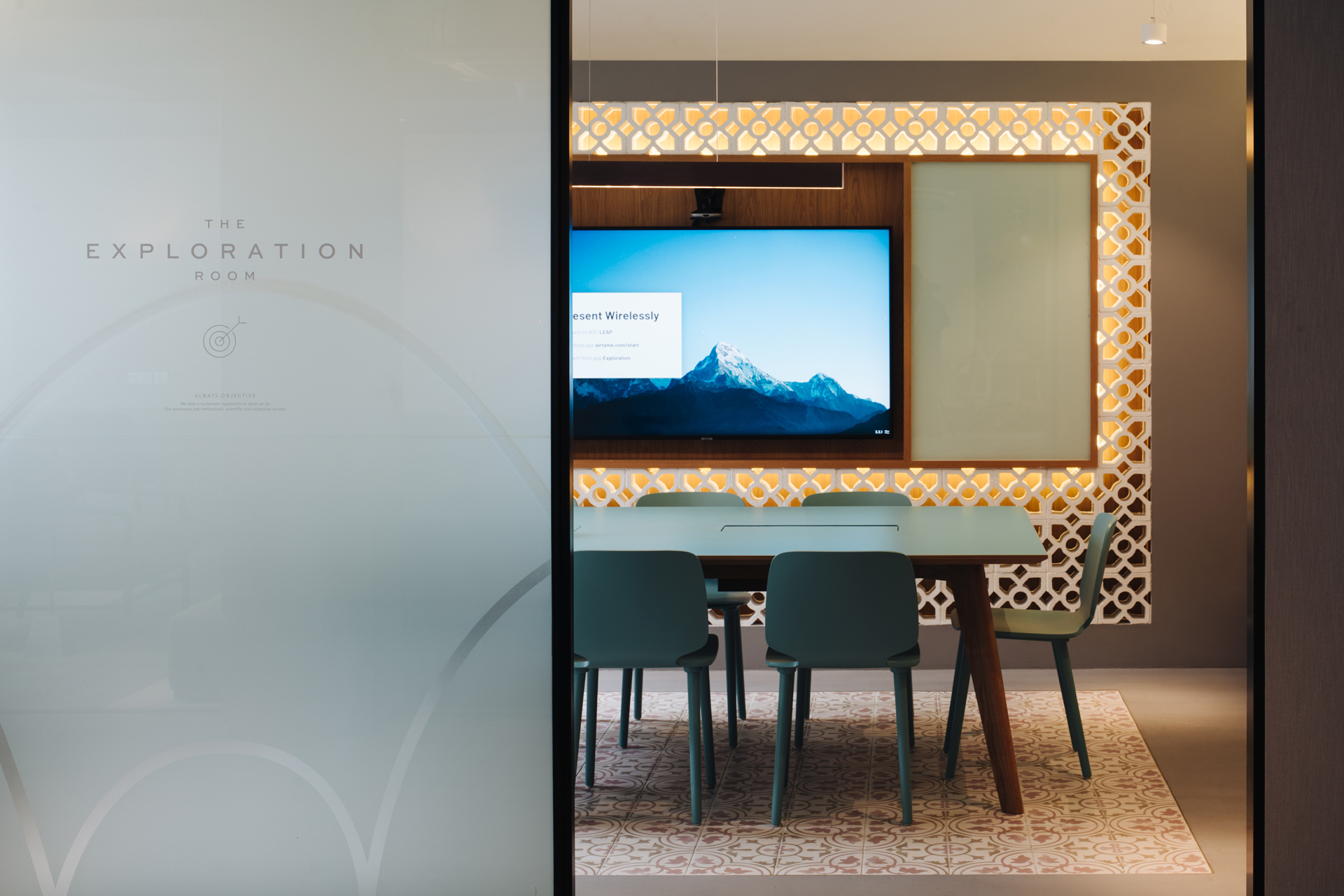
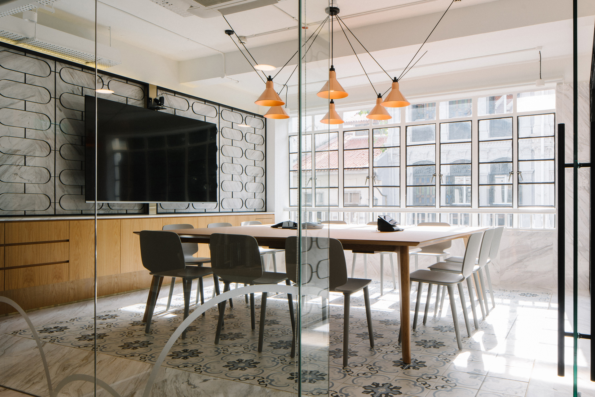
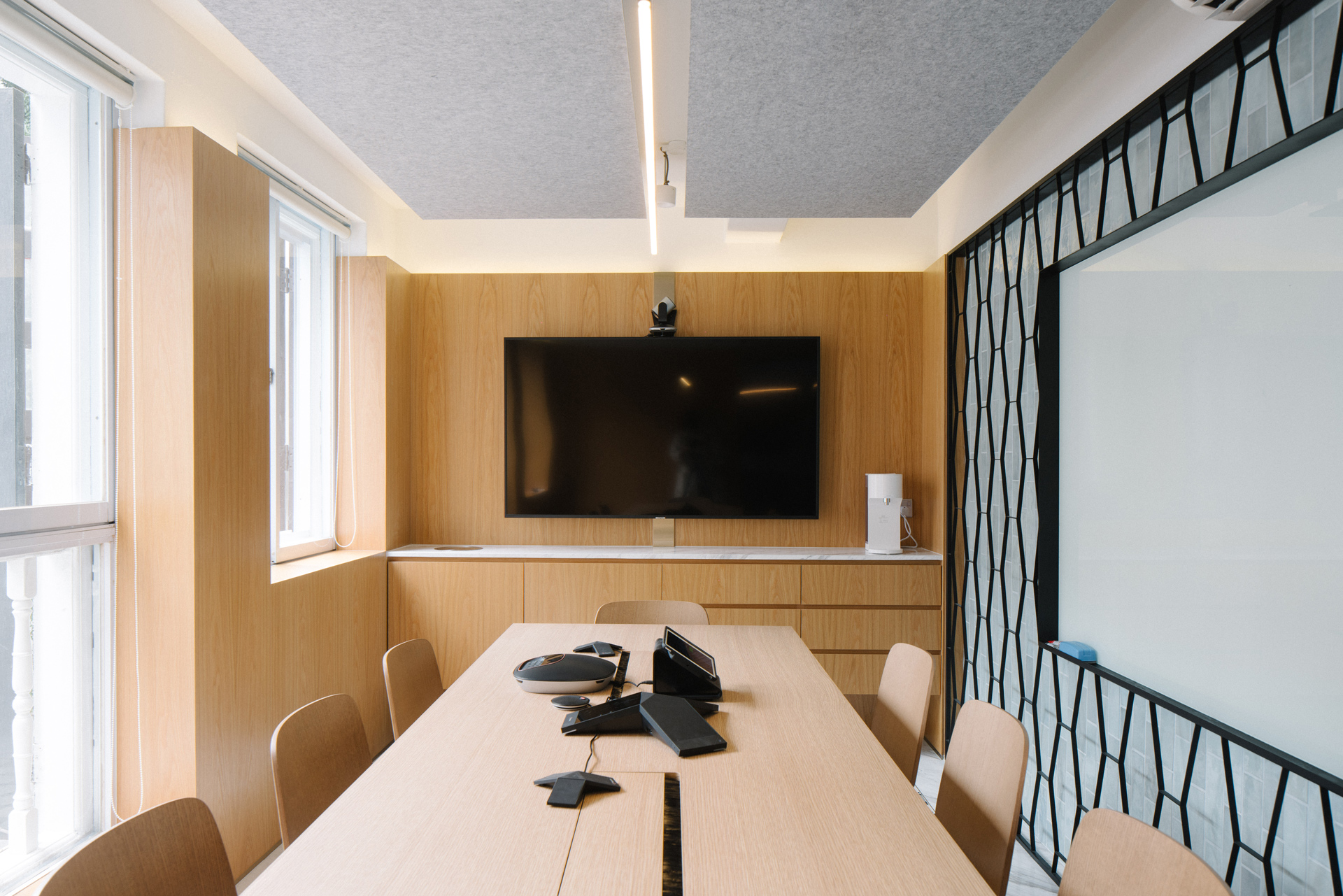
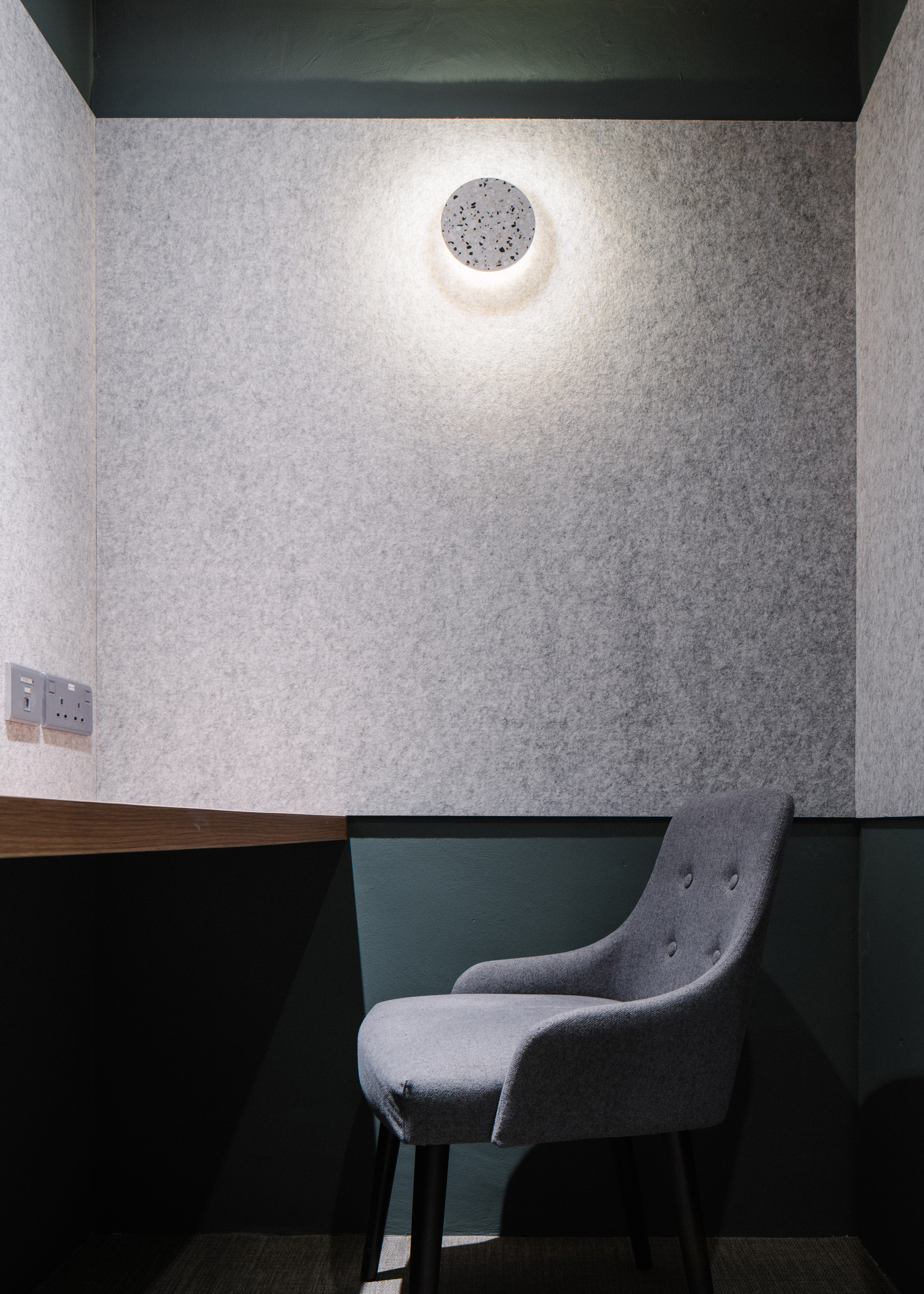
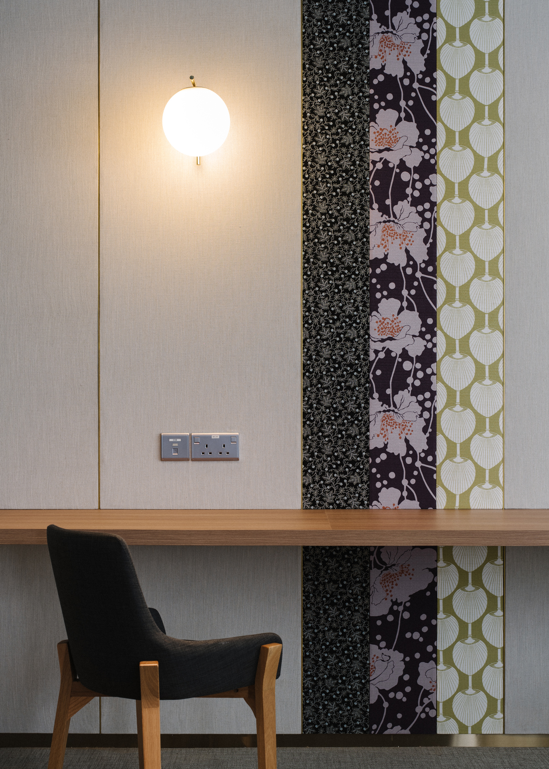
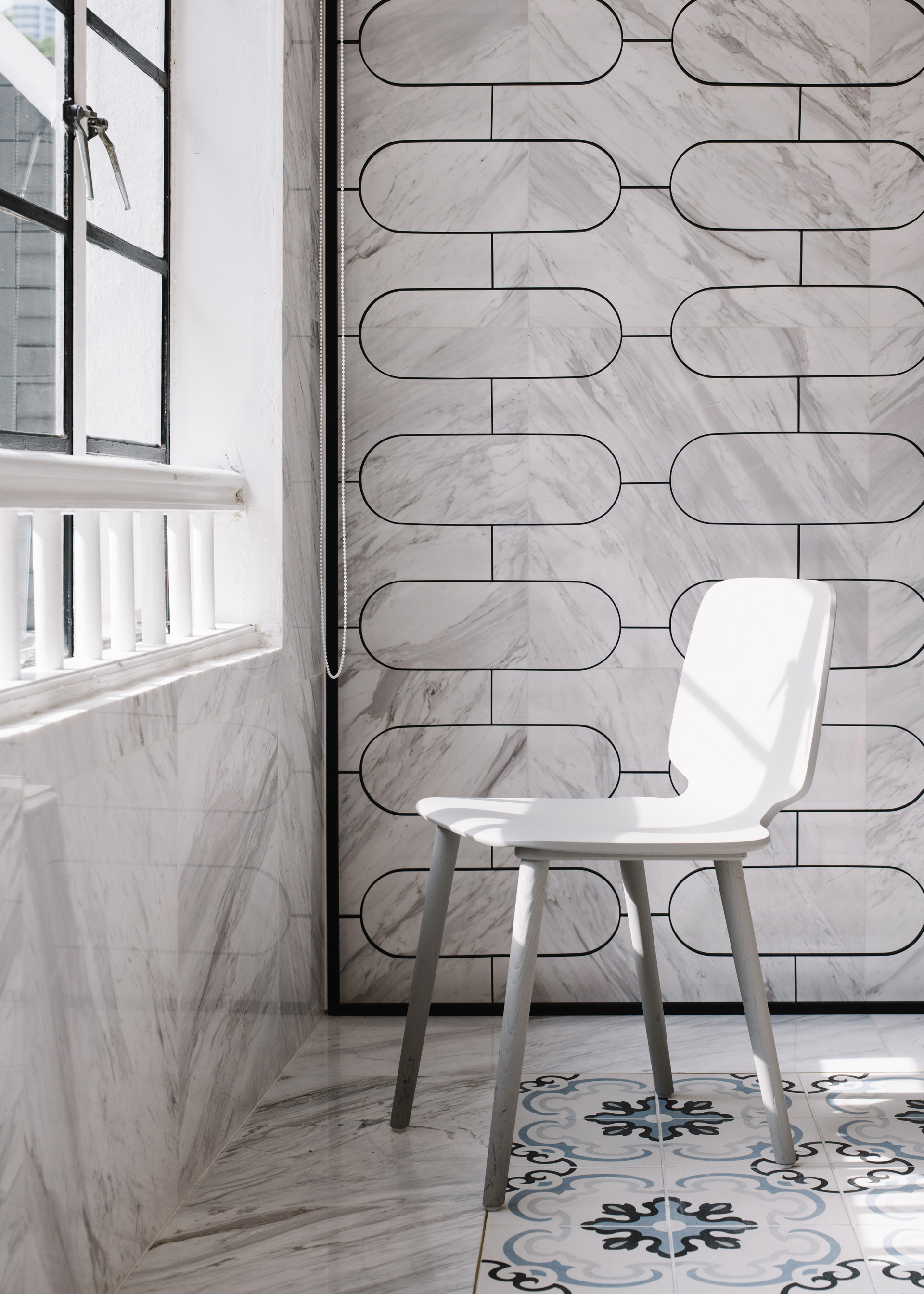
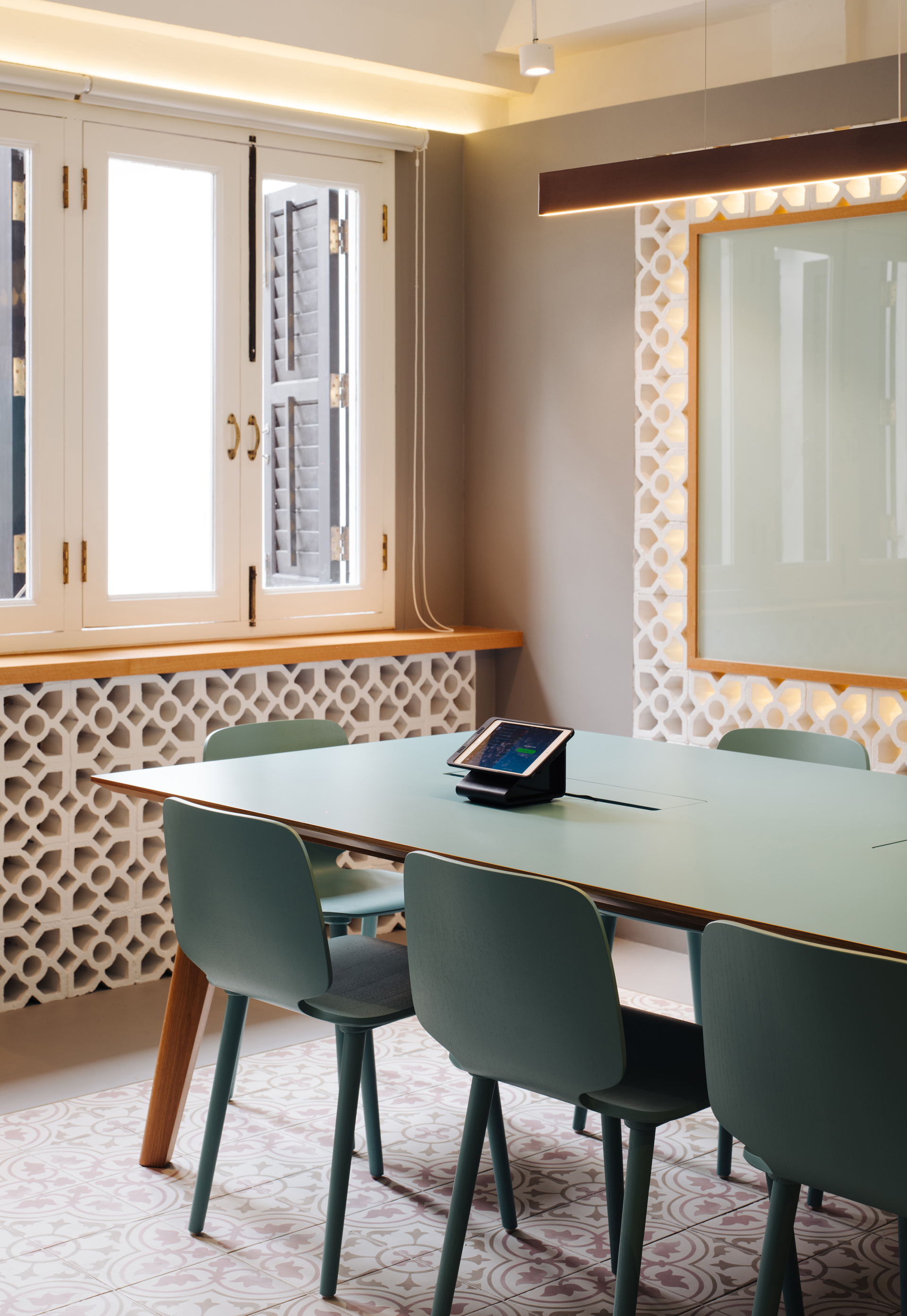
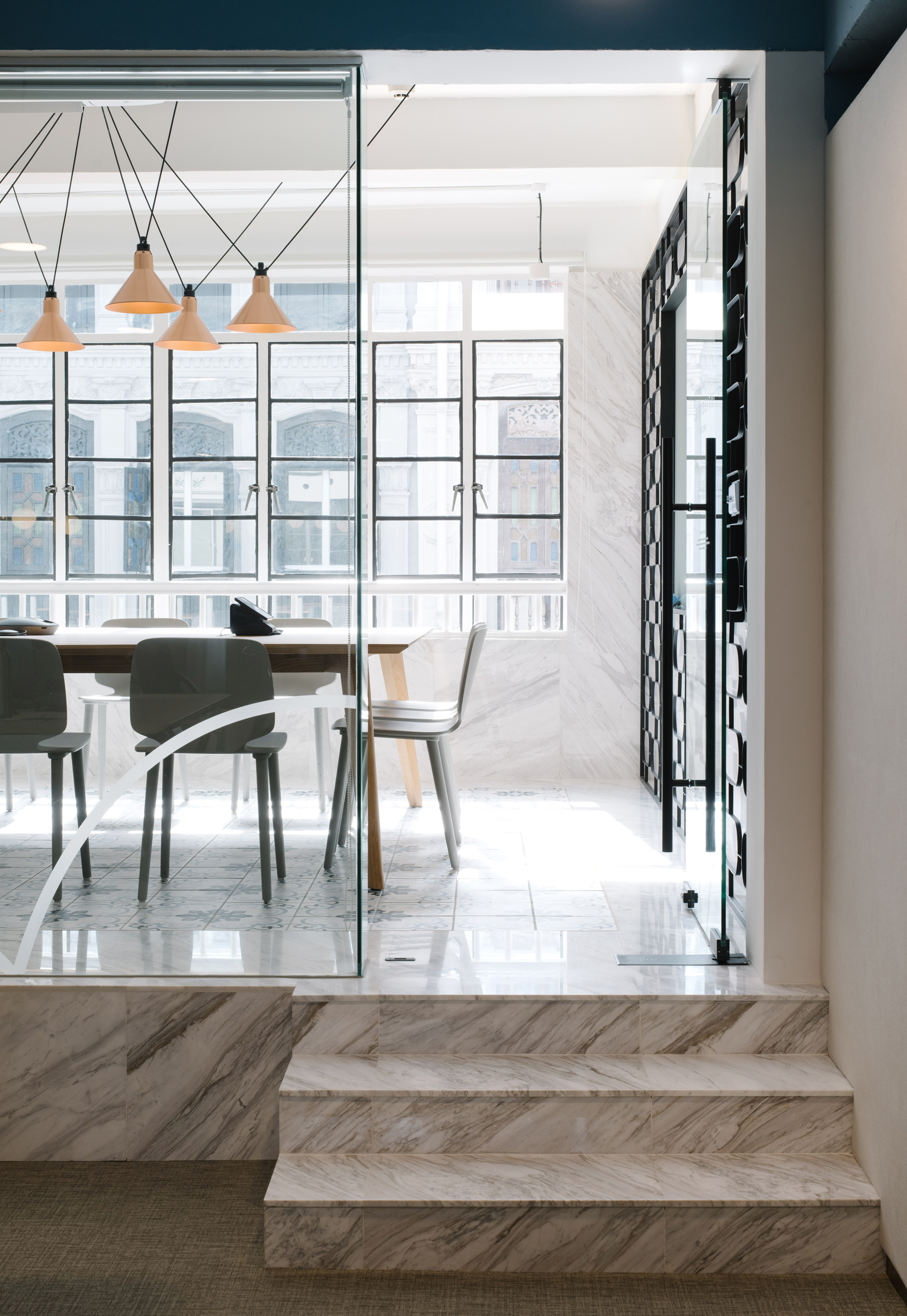

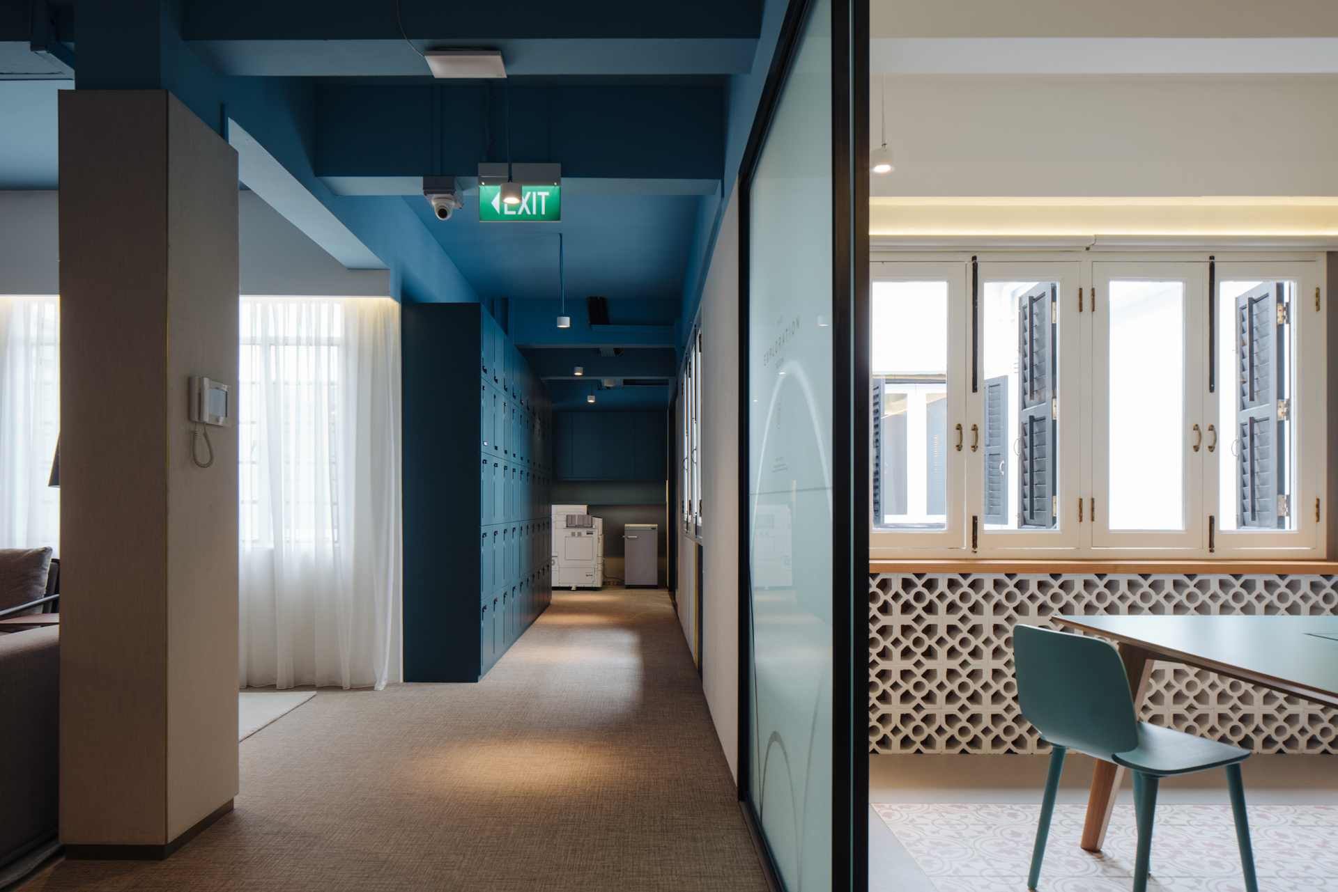

The shophouse is a southeast Asian archetype that is narrow, linear and long, often with courtyards or ‘air wells’ to bring light and air into deep plan. Located on the second storeys of a row of parallel shophouses that had interconnecting openings in their dividing walls, the office space and its design respond to the Client’s company philosophy of having a global influence while being firmly rooted in Asia. The challenge of this project was to create a workspace that was contemporary, modern and forward-looking while enhancing the character and unique nature of the architecture.
We were inspired by the idea that when originally separated by a wall, the interiors of the neighbouring shophouses would have had their own character. We tried to accentuate the difference between each ‘slice’ with their own identity and ambience.
We were inspired by the idea that when originally separated by a wall, the interiors of the neighbouring shophouses would have had their own character. We tried to accentuate the difference between each ‘slice’ with their own identity and ambience.
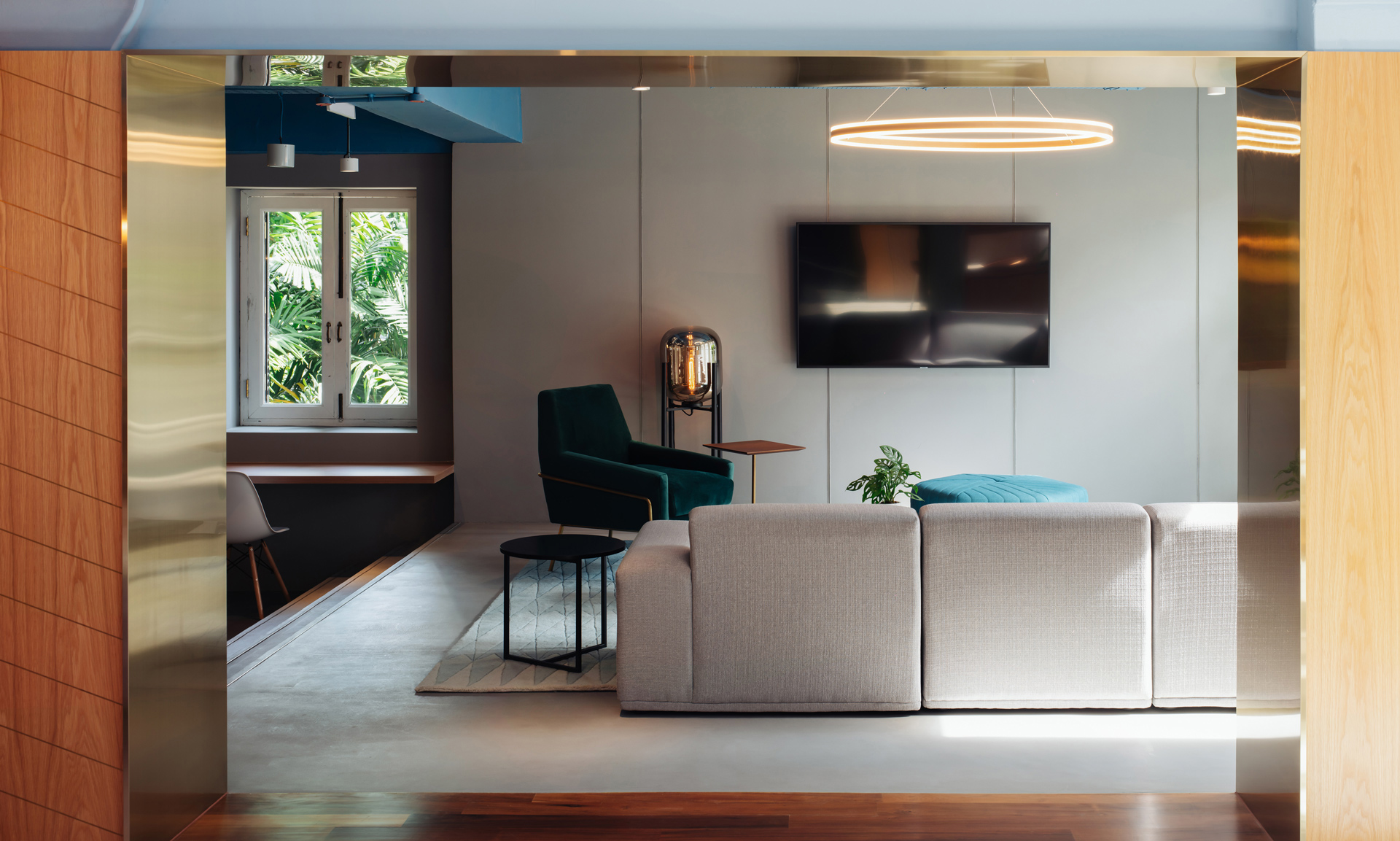
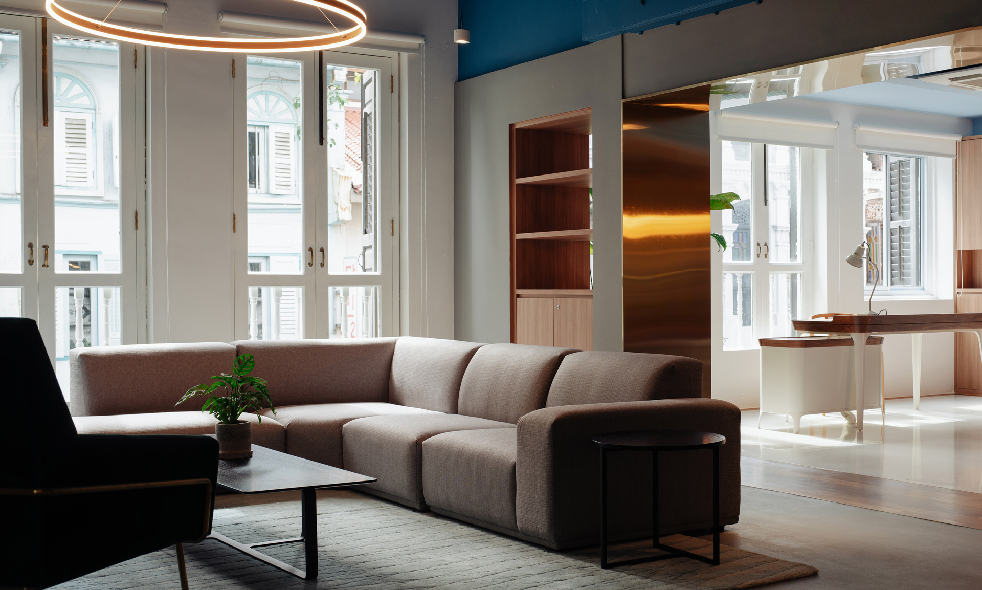
One shophouse slice takes on a more contemporary language, echoing the contemporary city of glass and steel outside, another re-interprets and re-invents traditional architectural elements of the shophouse such as ventilation blocks and timber louvered windows, yet another takes inspiration from the tropical verandah space. The threshold between each shophouse slice is accentuated by a brass portal which punctuates the movement from one space into another.
The previously cellular and labyrinthine spaces were opened up and the air wells within each shophouse were ‘liberated’ in plan; meeting rooms are deliberately placed away from the courtyards, allowing maximum daylight into the open office spaces and creating a clear ‘heart’ to each shophouse.
The previously cellular and labyrinthine spaces were opened up and the air wells within each shophouse were ‘liberated’ in plan; meeting rooms are deliberately placed away from the courtyards, allowing maximum daylight into the open office spaces and creating a clear ‘heart’ to each shophouse.
LOCATION
Singapore
YEAR
Completion 2018
DISCIPLINE
INTERIOR, BRANDING, GRAPHICS & ENVIRONMENTAL GRAPHICS
TYPOLOGY
OFFICE/CO-WORK
SIZE (SQM)
740
TEAM
Peter Sim, Michelle Lim, Cheung Yuting, Elwin Chan, Oh Wenxin, Rebekah Lee |
COLLABORATORS
Photographer: Studio Periphery
