Vital signs
Even the most well-thought out spaces can be confusing for first-time or infrequent visitors. Whether due to the sheer scale of space, the arrangement of programmes, or the need for privacy, exclusivity and isolation for particular facilities, very rarely do we enter a building and immediately discern where everything is.
Environmental graphics are the unsung hero in our navigational struggles. A good set of wayfinding can be near invisible, but bad wayfinding is sure to invite confusion and frustration. In this first Field Note of a series, we look at the basic principles of analyzing a site for environmental graphic design. This analysis will carry through into subsequent decisions for a complete, effective set of wayfinding design.
Environmental graphics are the unsung hero in our navigational struggles. A good set of wayfinding can be near invisible, but bad wayfinding is sure to invite confusion and frustration. In this first Field Note of a series, we look at the basic principles of analyzing a site for environmental graphic design. This analysis will carry through into subsequent decisions for a complete, effective set of wayfinding design.

When analyzing any site, understanding how users move through the space is key. The simplest way is to put yourself in their shoes. Where do you enter and exit? What are the key points and landmarks where you make directional decisions? Where should signs be located so you can see them?
USER CIRCULATION & DECISION POINTS
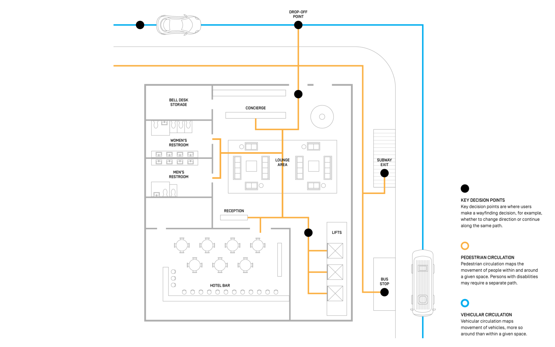
Understanding user circulation and decision-making hand-in-hand is important in creating a pleasant user experience. Users can be broadly categorized into pedestrians and vehicles, who require different spatial provisions. Both categories can be further broken down into different types: frequent visitors, first-timers, event-based guests and persons with disabilities, for example.
Decision points—particular areas and spots where users have to make a navigational decision, such as directional change—would pose different questions to different types of users.
Circulation paths and decision points hint to us the particular spaces where users may face difficulties in a navigational journey. This is where signage comes in, to help users overcome these difficulties and make informed navigational decisions with ease.
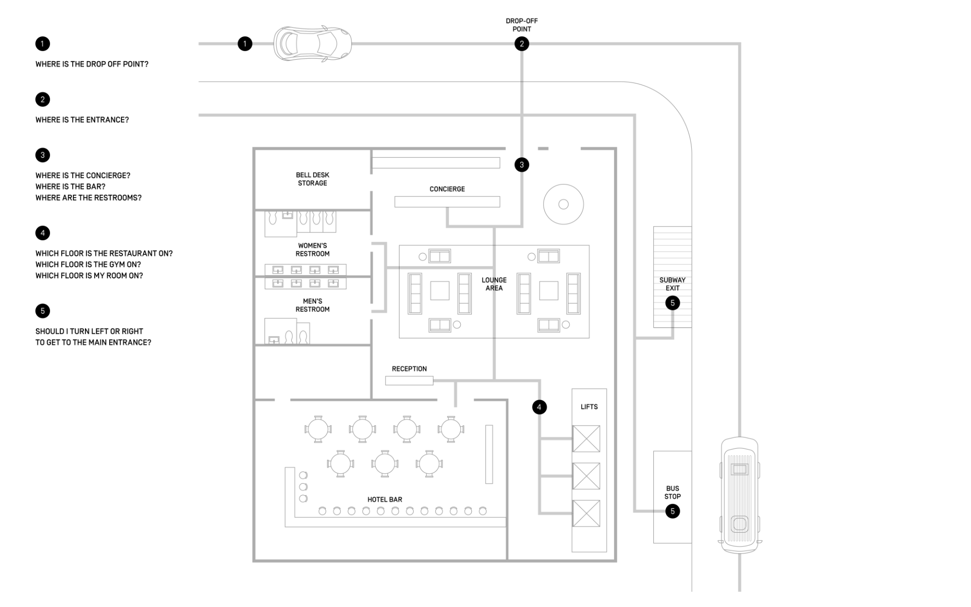
The following diagram illustrates a simple hotel lobby, with examples of where circulation paths and decision points may be located.

Thinking about the questions a visitor might have when moving to, through and from spaces is as important to environmental graphics as it is to spatial planning. Here, we imagine what might run through the head of a first-time visitor to this hypothetical hotel.

LOCATION OF SIGNS
Efficient signage should be located such that it optimizes user circulation, and reduces friction at key decision points. For instance, someone exiting the bus stop or subway may have to guess which way to turn, in order to get to the main entrance. Having a directional sign—or some other form of wayfinding feature—can save potential guests from doing some unnecessary guesswork.

While using plans can give you a good overall sense of a site, visiting in person can reveal challenges not evident in drawing. Do take the time to walk around your site, and talk to relevant consultants or client representatives, so that you get a good sense of end-user needs, and client goals.
BEST WHEN TAKEN WITH A PINCH OF SALT.
PLEASE EMAIL FARMACY@FARM.SG WITH YOUR FEEDBACK, OR IN CASE OF ANY INACCURACIES.
PLEASE EMAIL FARMACY@FARM.SG WITH YOUR FEEDBACK, OR IN CASE OF ANY INACCURACIES.
REF. NO.
HACKS-013-VITAL-SIGNS
CONTRIBUTOR(S)
Maggie Seah, Panna Chee, Goh Si Jie
PUBLISHED
01.04.20