A guide to: Wayfinding font sizes
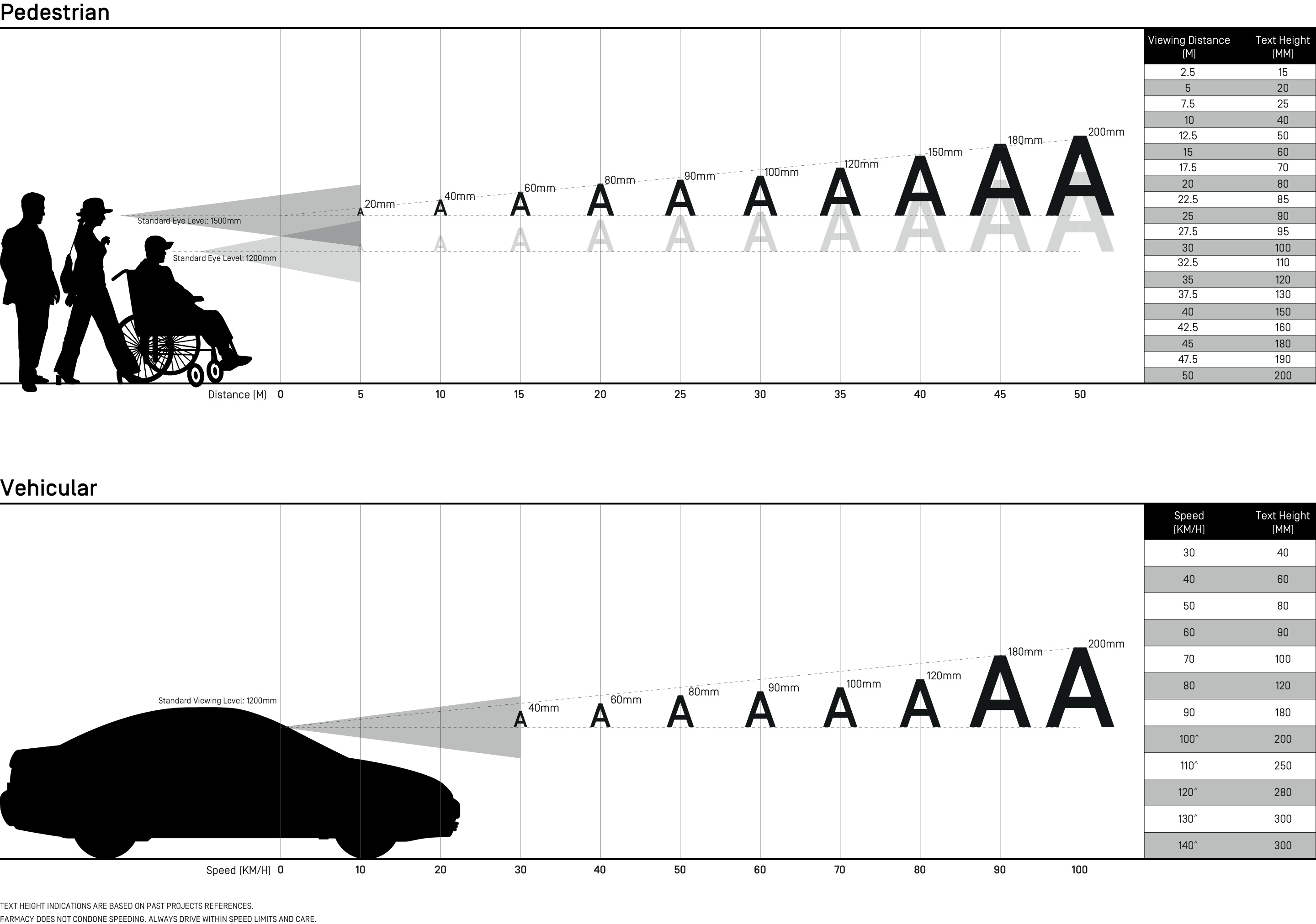
Ever had to squint at signage to look for your desired location on a building directory? When designing signage to be read at a range of distances and different eye levels, a letter visibility chart can be a useful gauge for choosing a comfortable font size for wayfinding. A legible font size makes it easier for viewers to read and understand signage at a glance. The optimal font size varies depending on your viewing relationship to the signage — whether you are walking, standing, seated or even driving.
As far as font typeface and style goes, bold face sans-serif fonts are our best bet when it comes to optimising the effectiveness of signage. The chart below suggests general sizes for bold face sans-serif fonts, but you may find that serif fonts require up-sizing. Some of our go-to bold face sans-serif fonts include Helvetica Neue Bold, Futura Bold, Gotham Bold, and Avenir Bold. Some signage, however, may be regulated by code, such as those for accessibility and fire provisions. In such cases, do remember to check that your signage is compliant with the relevant authorities.
As far as font typeface and style goes, bold face sans-serif fonts are our best bet when it comes to optimising the effectiveness of signage. The chart below suggests general sizes for bold face sans-serif fonts, but you may find that serif fonts require up-sizing. Some of our go-to bold face sans-serif fonts include Helvetica Neue Bold, Futura Bold, Gotham Bold, and Avenir Bold. Some signage, however, may be regulated by code, such as those for accessibility and fire provisions. In such cases, do remember to check that your signage is compliant with the relevant authorities.

BEST WHEN TAKEN WITH A PINCH OF SALT.
PLEASE EMAIL FARMACY@FARM.SG WITH YOUR FEEDBACK, OR IN CASE OF ANY INACCURACIES.
PLEASE EMAIL FARMACY@FARM.SG WITH YOUR FEEDBACK, OR IN CASE OF ANY INACCURACIES.
REF. NO.
HACKS-007-WAYFINDING-SIZE
CONTRIBUTOR(S)
PANNA CHEE, OH WENXIN
PUBLISHED
29.03.19