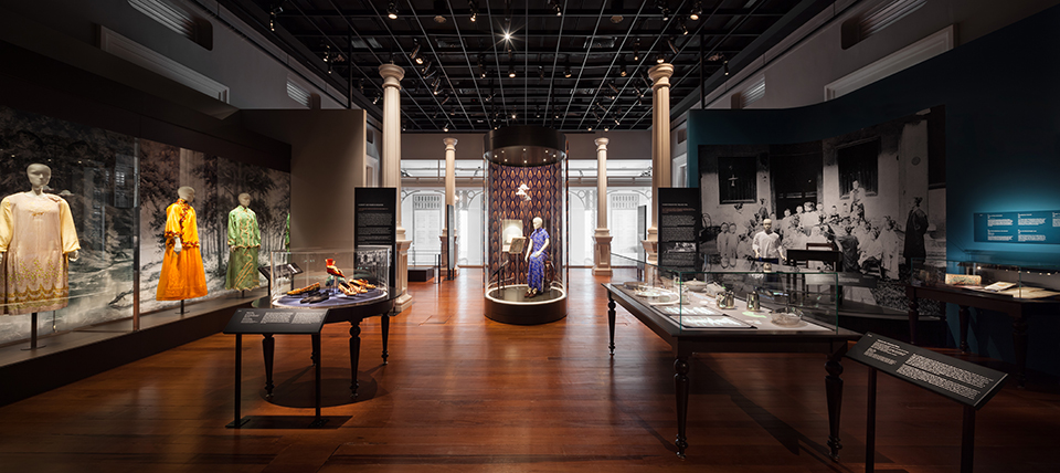
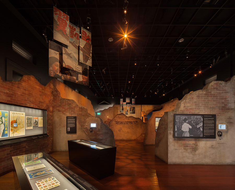
A guide to: Exhibition font sizes
Artwork, and artefacts, graphic elements, lighting, spatial flow and text work together towards an exhibition's curatorial intent. Even with the growing trend of audio guides and electronic displays, wall text is still king when it comes to conveying information. An optimal font size improves the readability and legibility of text. While there is no one-size-fits-all, this Field Note suggests some font sizes which may be used for the different texts within an exhibition.
Introduction wall

| ITEM | FONT SIZE (PT) | FONT HEIGHT (MM) | REMARKS |
| Exhibition Logo | - | 50 – 150 | To be adjusted based on surface space available, and intended level of prominence |
| Main Title | 300 | 75 | To be adjusted based on intended level of prominence |
| Section Title | 150 | 40 | Safely, 3x the size of Main Body Text to ensure distinct contrast |
| Sub-section Title | 100 | 25 | To be determined in relation to Section Title |
| Main Body Text | 50 | 15 | A comfortable font size readable by most (given reading distance) |
| Notes: 1. Assuming the exhibition's lighting condition is maintained at 50 lux, reading distance is most comfortable between 0.5M - 1.5M. 2. For an optimal reading height, the centre of the text should be maintained at 1.5M from the ground. | |||
Caption label

| ITEM | FONT SIZE (PT) | FONT HEIGHT (MM) | REMARKS |
| Main Header | < 24 | < 6 | To consider bold styling, if intended to be larger |
| Sub-header | 21 | 5 | To ensure distinct contrast to Main Header |
| Body Text | 16 | 4 | A comfortable font size readable by most (given reading distance) |
| Lender Line/Accession Number | > 12 | > 3 | Minimum font size for reading wall text at close proximity |
| Supplementary Icon(s) | - | 18 - 25 | To manage size in relation to rest of the text. Typically kept small to prevent distraction. |
| Notes: 1. Assuming the exhibition's lighting condition is maintained at 50 lux, reading distance is most comfortable between 0.5M - 1.5M. 2. For an optimal reading height, the top of the label should be maintained at 1.5M from the ground. | |||
Showcase label

| ITEM | FONT SIZE (PT) | FONT HEIGHT (MM) | REMARKS |
| Main Header | < 24 | < 6 | To consider bold styling, if intended to be larger |
| Sub-header | 21 | 5 | To ensure distinct contrast to Main Header |
| Body Text | 16 | 4 | A comfortable font size readable by most (given reading distance) |
| Lender Line/Accession Number | > 12 | > 3 | Minimum font size for reading wall text at close proximity |
| Supplementary Icon(s) | - | 18 - 25 | To manage size in relation to rest of the text. Typically kept small to prevent distraction. |
| Notes: 1. Assuming the exhibition's lighting condition is maintained at 50 lux, reading distance is most comfortable between 0.5M - 1.5M. 2. Assuming height of showcase at 0.8M from ground | |||
Supplementary graphics

| ITEM | FONT SIZE (PT) | FONT HEIGHT (MM) | REMARKS |
| Timeline | 30 - 40 | To be adjusted according to amount of content and space available | |
| Wall Quotes | 150 - 300 | 40 - 75 | To be adjusted based on intended level of prominence |
| Advisory Labels | 50 - 100 | 15 - 25 | To be adjusted in relation to accompanying object and space available |
| Notes: 1. Center of text should be maintained at 1.5M from ground for most optimal reading height 2. Graphics or font sizes to be adjusted, according to wall space available 3. Reading range most optimal between 0.8M - 1.8M from ground. | |||
*This article follows international museum standards and guidelines wherever possible.
BEST WHEN TAKEN WITH A PINCH OF SALT.
PLEASE EMAIL FARMACY@FARM.SG WITH YOUR FEEDBACK, OR IN CASE OF ANY INACCURACIES.
PLEASE EMAIL FARMACY@FARM.SG WITH YOUR FEEDBACK, OR IN CASE OF ANY INACCURACIES.
REF. NO.
HACKS-004-EXHIBITION-FONT-SIZES
CONTRIBUTOR(S)
GEORGINA TAN, GOH SI JIE, OH WEN XIN
PUBLISHED
08.08.18